
This guide shows Administrators how to make the Media Control Panel look like their own product, from basic settings such as company name and logo through to custom CSS. The Media Control Panel (MediaCP) is a web-based control panel for managing streaming services, and it’s the interface your customers use to manage their streams. Because it’s the first thing your customers see, a consistent brand helps it feel like part of your service rather than a third-party tool.
What your license allows
Some branding features depend on your license type. Check this table before you start so you know which steps apply to you:
| Feature | Standard licenses | Unlimited licenses |
| Company name, logos, and favicon | Yes | Yes |
| Custom HTML header & footer | Yes | Yes |
| Panel URL | Yes | Yes |
| Login Background Image | No | Yes |
| Removing MediaCP linkback | No | Yes |
| Custom social media apps | No | Yes |
If you have a standard license and want the locked features, you can upgrade your license at any time.
Basic Configuration
To start branding your platform the basic changes to start with will be setting your company name and logo in the panel.
Set Company Name
As an Administrator you can navigate to System Config and set your Company Name. This is shown in the browser title-bar as well as any emails sent by the panel.
Upload your logos and favicon
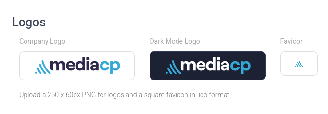
Along with this you should upload a light and dark mode version of your logo to be displayed in the panel as well as a matching favicon to brand the browser tab. The logos should be PNG files with a recommended resolution of 250 x 60 px. Favicons must be .ico format in order to function.
Upload a login background (Unlimited License)
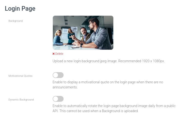
If you have an Unlimited License can replace the default login backgrounds with an image that matches your brand.
- Format: jpeg only
- Dimensions: 1920 x 1080px
Custom HTML Styling
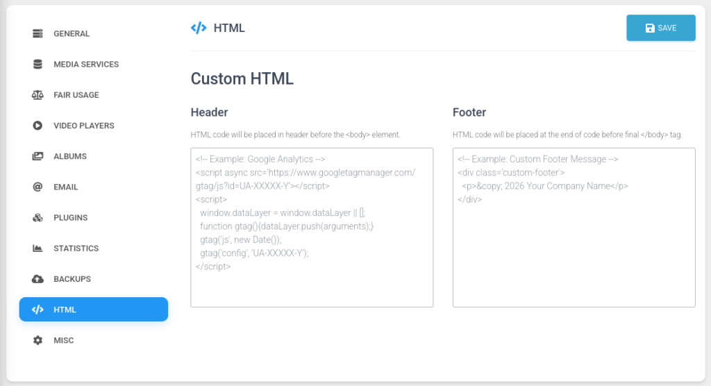
To bring your panel branding to the next level you can also add Custom HTML to the header and footer of the panel. This allows CSS overrides to change the colour of items as well as the embedding of additional items. We also see some customers add support chat functionality or links to their website for documentation.
Where to add it
Go to Administration → System Config → HTML and paste your code into the Header or Footer field. The header is the best place for CSS overrides, because the styles load before the page renders.
Example Theme
We used this approach to brand a panel for planAtude, an Australian business advisor. The panel uses planAtude’s green as its primary colour and its Poppins font, and the overrides cover buttons, the sidebar, tabs, cards, form fields, and toggles.
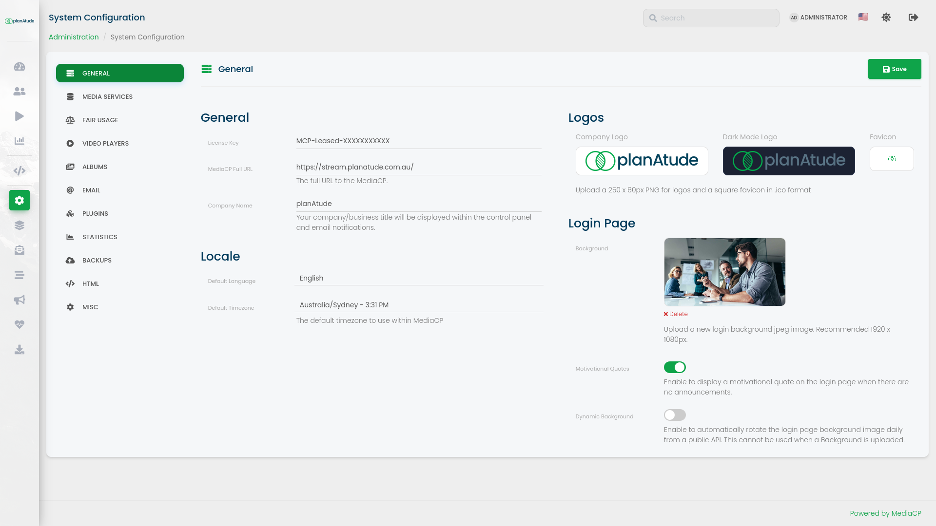
Copy the code below as a starting point. Each variable in the :root block controls a colour, so change those first.
Header CSS Override (Click to Expand)
<style>
@import url('https://fonts.googleapis.com/css2?family=Poppins:wght@300;400;500;600;700&display=swap');

:root {
  --g: #0fa44a;
  --g-rgb: 15,164,74;
  --g-dark: #0b8539;
  --g-darker: #086a2d;
  --g-light: #eef8f2;
  --navy: #003b5c;
  --card: #f5f7f9;
  --card-border: #e1e6ea;
}

/* ===== Typography (Poppins, as on planatude.com.au) ===== */
body, .content, .sidebar, .navbar,
h1, h2, h3, h4, h5, h6, p, label, td, th,
.btn, .form-control, .nav > li > a, .panel-title, .breadcrumb {
  font-family: 'Poppins', 'Roboto', Helvetica, Arial, sans-serif;
}
body:not(.dark-mode) h1,
body:not(.dark-mode) h2,
body:not(.dark-mode) h3,
body:not(.dark-mode) h4,
body:not(.dark-mode) .panel-title,
body:not(.dark-mode) .navbar-brand { color: var(--navy); }
body:not(.dark-mode) .content label.text-bold,
body:not(.dark-mode) .content strong { color: var(--navy); }

/* ===== Buttons ===== */
.btn-primary, .btn-primary:focus, .btn-primary:active {
  background: var(--g) !important;
  border-color: var(--g) !important;
  color: #fff !important;
  border-radius: 3px !important;
  text-transform: none !important;
  font-weight: 600 !important;
  letter-spacing: 0 !important;
  box-shadow: 0 2px 2px 0 rgba(var(--g-rgb),.14), 0 3px 1px -2px rgba(var(--g-rgb),.2), 0 1px 5px 0 rgba(var(--g-rgb),.12) !important;
}
.btn-primary:hover { background: var(--g-dark) !important; }
.btn-link, .btn-simple.btn-primary { color: var(--g) !important; }
.btn-info, .btn-info:hover, .btn-info:focus {
  background: var(--g) !important;
  border-color: var(--g) !important;
  border-radius: 3px !important;
}

/* ===== Sidebar and nav ===== */
.sidebar[data-color="blue"]:after,
.sidebar[data-color="blue"]:before { background: var(--g) !important; }
.sidebar li.active > a,
.sidebar[data-active-color] li.active > a,
.sidebar[data-active-color="blue"] .nav li.active > a,
li.active a {
  background: var(--g) !important;
  background-color: var(--g) !important;
  color: #fff !important;
  box-shadow: 0 4px 20px 0 rgba(0,0,0,.14), 0 7px 10px -5px rgba(var(--g-rgb),.4) !important;
}
li.active a:hover,
.sidebar[data-active-color="blue"] .nav li.active > a:hover {
  background: var(--g-dark) !important;
  color: #fff !important;
}
.nav-pills > li.active > a,
.nav-pills > li.active > a:hover,
.nav-pills > li.active > a:focus { background: var(--g) !important; }
.sidebar .nav li:not(.active) > a:hover i { color: var(--g); }

/* ===== Service menu (106.7 header + Overview/Configure items) ===== */
body .service-menu .submenu-service-detail.panel-heading,
body .service-menu .panel-heading.submenu-service-detail,
.submenu-service-detail {
  background: var(--g) !important;
  background-image: none !important;
  border-color: var(--g) !important;
}
body .service-menu .navbar-collapse .nav > li.active > a,
body .service-menu ul.nav > li.active > a,
body .service-menu .nav li.active > a {
  background: var(--g) !important;
  background-color: var(--g) !important;
  color: #fff !important;
  box-shadow: 0 4px 20px 0 rgba(0,0,0,.14), 0 7px 10px -5px rgba(var(--g-rgb),.4) !important;
}
body .service-menu .nav > li.active > a:hover,
body .service-menu .nav > li.active > a:focus {
  background: var(--g-dark) !important;
  background-color: var(--g-dark) !important;
  color: #fff !important;
}
body .service-menu .nav li:not(.active) > a:hover,
body .service-menu .nav li:not(.active) > a:focus {
  background: var(--g-light) !important;
  color: var(--g) !important;
}

/* ===== Tab bar (GENERAL / LIMITS / FEATURES ...) ===== */
body .nav-tabs,
body ul.nav-tabs.nav-tabs-line,
#myTab.nav.nav-tabs {
  background: var(--g) !important;
  background-color: var(--g) !important;
}
#myTab li.active a,
body .nav-tabs > li.active > a,
body .nav-tabs > li.active > a:focus {
  background: var(--g-dark) !important;
  color: #fff !important;
  border-bottom-color: var(--g-dark) !important;
}
/* Hover for non-active tabs on light backgrounds (System Config side tabs etc.) */
body .nav > li:not(.active) > a:hover,
body .nav > li:not(.active) > a:focus,
body #myTab li:not(.active) a:hover {
  background: var(--g-light) !important;
  color: var(--g) !important;
}

/* Hover for the horizontal green tab bar only: translucent white */
body ul.nav-tabs.nav-tabs-line#myTab > li:not(.active) > a:hover,
body ul.nav-tabs.nav-tabs-line > li:not(.active) > a:hover {
  background: rgba(255,255,255,.15) !important;
  color: #fff !important;
}
#active-tab-title i { color: var(--g) !important; }

/* ===== Cards: light grey with green left edge (like the site's service cards) ===== */
body:not(.dark-mode) .content .panel:not(.panel-primary):not(.service-menu) {
  background: var(--card);
  border: 1px solid var(--card-border);
  border-left: 4px solid var(--g);
  border-radius: 3px;
}
.panel-primary > .panel-heading {
  background: var(--g) !important;
  border-color: var(--g) !important;
  color: #fff !important;
}
.panel-primary { border-color: var(--g) !important; }

/* ===== Text, links, labels ===== */
a, .text-primary, .text-info { color: var(--g); }
a:hover, a:focus { color: var(--g-dark); }
.text-default,
.statistics-panels .panel-heading i,
.broadcasting-panel .text-default { color: var(--g) !important; }
.label-primary, .label-info, .badge { background: var(--g) !important; }
.alert-info { background: var(--g) !important; }

/* ===== Pagination, progress, dropdowns ===== */
.pagination > .active > a,
.pagination > .active > span,
.pagination > .active > a:hover {
  background: var(--g) !important;
  border-color: var(--g) !important;
  color: #fff !important;
}
.progress-bar, .progress-bar-info, .progress-bar-primary { background: var(--g) !important; }
.dropdown-menu > li > a:hover,
.dropdown-menu > li > a:focus {
  background: var(--g) !important;
  color: #fff !important;
}

/* ===== Form fields ===== */
.form-group.is-focused .form-control,
.form-control:focus {
  background-image: linear-gradient(var(--g), var(--g)), linear-gradient(#d2d2d2, #d2d2d2) !important;
}
.form-group.is-focused label,
.form-group.is-focused .control-label { color: var(--g) !important; }
input[type="checkbox"], input[type="radio"] { accent-color: var(--g) !important; }
.checkbox input[type=checkbox]:checked + .checkbox-material .check { background: var(--g) !important; }

/* ===== Toggles: grey off, green on ===== */
.switch .slider,
.switch .slider.round { background: #ccc !important; }
.switch.checked .slider,
.switch.checked .slider.round,
.switch input:checked + .slider,
.switch input:checked ~ .slider,
input:checked + .slider.round { background: var(--g) !important; }
.togglebutton label input[type=checkbox]:checked + .toggle {
  background-color: rgba(var(--g-rgb),.5) !important;
}
.togglebutton label input[type=checkbox]:checked + .toggle:after {
  background-color: var(--g) !important;
  border-color: var(--g) !important;
}

/* ===== World map ===== */
.jvm-region[fill="#438ccb"]   { fill: #0fa44a !important; }
.jvm-region[fill="#438ccb85"] { fill: #0fa44a85 !important; }
.jvm-region[fill="#438ccb75"] { fill: #0fa44a75 !important; }
.jvm-tooltip { background-color: var(--g) !important; }

/* ===== Chart (canvas colors can't be set with CSS, so hue-shift blue to green) ===== */
#line-chart { filter: hue-rotate(-66deg) saturate(1.1); }
</style>
This is just the start, custom HTML can be used to add and embed all kinds of customisable items to further brand your Media Control Panel.
Next steps
For the custom YouTube and Facebook Apps, follow the guides in our Admin Server Manual:
If you’ve branded your panel, we’d love to see it. Share your results with us on our Facebook Group: https://www.facebook.com/groups/mediacp
